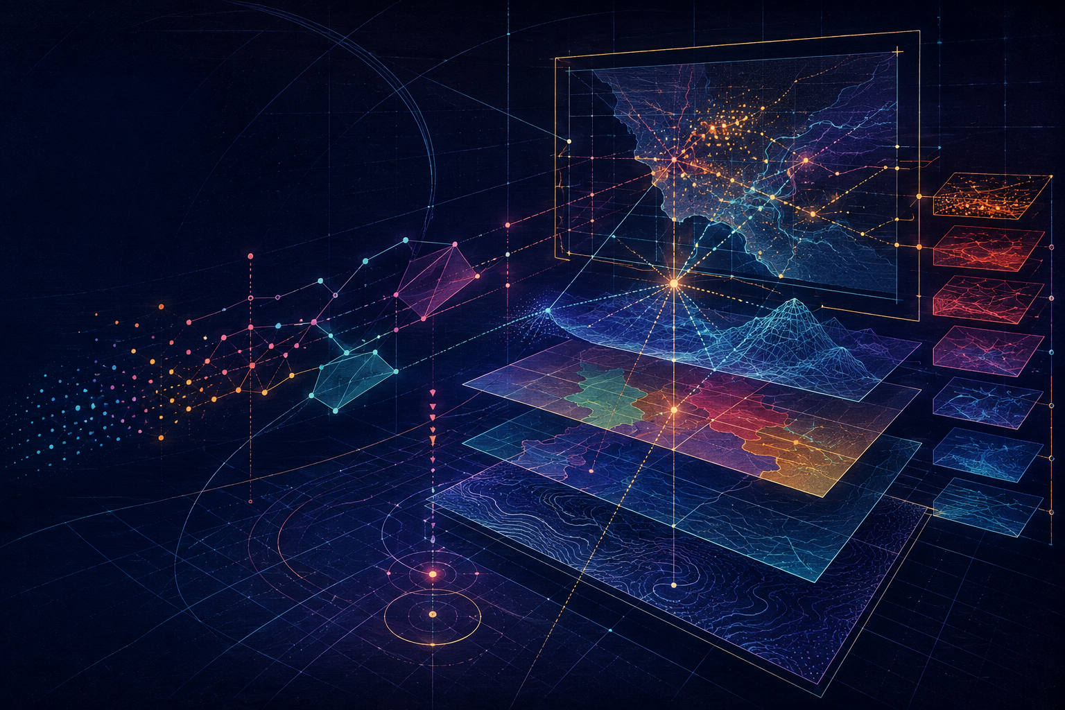
Programmers are often comfortable with spatial data right up until they have to make a map.
The API is not the hard part. A point is a point. A polygon is a polygon. GeoJSON is readable. The query runs.
Then the map looks wrong.
The labels collide. The colors imply categories that do not exist. A choropleth makes a large empty county look more important than a dense city. The geometry is technically valid, but the result is difficult to read and even harder to trust.
This is where cartography begins.
Cartography is not the decorative layer added after the spatial application works. It is a way of reasoning about what location means, how evidence is represented, and what a reader will conclude from a composed view of data.
Coordinates are not locations yet
A coordinate pair looks precise. It is tempting to treat it as a location immediately.
But (0, 0) is not meaningful without context. Are those degrees or meters? Which datum? Which axis order? Is the coordinate geographic or projected? Does the number describe a point on the earth, a position in a local engineering grid, or a pixel in an image?
Cartographers learn early that coordinates are only locations when attached to a reference system.
This is more than metadata hygiene. It is part of the meaning of the data. A layer without a trustworthy coordinate reference system is not merely inconvenient to plot. It is not yet safe to compare with another layer.
The programming equivalent is an untyped value with an undocumented unit. A number called distance is not enough. You need to know whether it means meters, feet, degrees, or something else.
In fact, a coordinate reference system is part of the type of a geometry. A point in EPSG:4326 and a point in a local State Plane system may both be stored as pairs of floating-point numbers, but they are not interchangeable values. Treating them as interchangeable is the spatial equivalent of adding meters to seconds because both happen to be numbers.
Geometry is not geography
Spatial software tends to expose geometry as an object with methods: calculate a buffer, intersect two shapes, find a centroid. That is useful, but it can hide a distinction that matters.
Geometry describes mathematical shapes in a coordinate space.
Geography describes positions and relationships on the earth.
Those two ideas often agree at a local scale. They diverge when the area gets large, when the coordinate system changes, or when the earth's curvature matters. A straight line in a projected map may not represent the shortest path across the globe. A buffer in degrees does not represent a consistent distance everywhere.
The geometry engine can execute the operation perfectly and still answer the wrong geographic question.
Before calling a spatial method, ask what surface the operation is supposed to describe.
Points, lines, and polygons are not just data structures
The basic geometry types are familiar to programmers. A point has coordinates. A line is an ordered set of vertices. A polygon encloses an area.
But each type also carries different assumptions.
A point is often treated as an exact location, even when it represents a moving vehicle, a sampled address, or the approximate center of a large site. A line may represent a road centerline, a boundary, a route, or a flow. A polygon may represent legal ownership, ecological suitability, statistical estimation, or a rough service area.
The vertices do not tell you which of these meanings is intended. The data model and its use do.
This is one place where software abstractions leak. A generic Polygon class cannot tell you whether its boundary is authoritative, approximate, or merely convenient for visualization. That judgment belongs to the domain.
Topology is about relationships, not shapes
Two polygons can look adjacent without sharing an edge. Two lines can cross visually without having a node at their intersection. A set of parcels can have gaps and overlaps while still rendering as a plausible neighborhood.
Cartography and GIS care about these relationships because maps are often used to reason about them:
- what touches what?
- what contains what?
- what connects to what?
- where are the gaps?
- which boundaries are shared?
Topology is the discipline of making those relationships explicit and checking whether they are valid for the task.
For a programmer, the important lesson is that visual proximity is not the same thing as a data relationship. A map can draw two features next to each other without the dataset asserting adjacency. A spatial predicate is a claim, not just a convenience method.
Projection is controlled distortion
There is no flat map of the earth without distortion. Every projection preserves some properties by sacrificing others.
Some projections preserve local shape. Some preserve area. Some preserve distance or direction in particular circumstances. None preserves everything everywhere.
This is not a flaw to be eliminated. It is a design choice to be made visible.
A world map optimized for visual balance may be a poor map for comparing area. A navigation map may prioritize direction and local distance. A map showing population by country may need an equal-area projection so the visual units do not quietly exaggerate the importance of high-latitude regions.
The projection is part of the argument.
If your application lets users compare shapes or areas, projection is not an implementation detail buried in a utility function. It affects what the interface says.
Attributes are attached to geometry, but they are not geometry
Spatial records often look like ordinary objects:
{
  "type": "Feature",
  "geometry": {"type": "Point", "coordinates": [-77.03, 38.91]},
  "properties": {"name": "Washington"}
}
The geometry says where. The attributes say something about what is there, when it was measured, how it was classified, or who maintains the record.
These parts have different failure modes. A geometry can be valid while the attribute is stale. An attribute can be accurate while the point is generalized. Joining a table to geometry can create duplicates or silently discard records.
Cartographic judgment begins by asking what the attributes mean before deciding how to display them. A field called population is not enough. Population at what date? Counted or estimated? Total or density? Assigned to a polygon by residence, administrative area, or reporting convention?
The map cannot repair an ambiguous field. It can only make the ambiguity look official.
Classification is a decision, not a color ramp
When numeric data becomes a map, it usually has to be classified. Values are grouped into bins, and each bin receives a visual treatment.
That choice changes the pattern a reader sees.
Equal intervals are easy to explain but may leave most features in one class. Quantiles distribute features across classes but can make very different values look similar. Natural breaks emphasize gaps in the data. A manually chosen threshold may reflect a policy or operational decision.
None is the universally correct algorithm.
A programmer may naturally reach for the default classifier exposed by a library. A cartographer asks what the classes are for. Are they meant to reveal clusters, support a decision threshold, compare places over time, or provide a simple legend for a general audience?
Classification is where analysis becomes communication.
Symbology is encoding
Color, size, shape, opacity, and line weight are channels for encoding information. They are not interchangeable decoration.
A sequential color ramp usually suggests ordered magnitude. A diverging ramp suggests a meaningful midpoint. Categorical colors suggest difference without order. A large symbol attracts attention even if its underlying value is not the largest.
These signals interact with human perception. Some colors are easier to distinguish than others. Some combinations are inaccessible to people with color-vision deficiencies. Transparency can reveal overlap, but it can also make categories blend into an invented third category.
The rendering code may be correct while the encoding is misleading.
That is why a cartographer tests the map as a reader, not just as a renderer. What appears first? What looks comparable? What disappears? What does the legend promise that the map does not deliver?
Layers create visual hierarchy
Most web maps are built as layers, which makes the data model feel naturally aligned with the visual model. But drawing order is not the same thing as hierarchy.
A layer can be present without being important. A basemap can provide context without competing with the analytical layer. Labels may need to sit above roads but below the features they identify.
Good map composition gives the reader a path through the information. It establishes:
- what to look at first
- what provides context
- what can be compared
- what is secondary
- where uncertainty or missing data matters
A map with every layer switched on is not comprehensive. It is usually undecided.
Maps are composed arguments
The phrase “map of the data” sounds neutral, but maps do not simply display data. They select an extent, a scale, a projection, a classification, a symbol system, and a set of labels. Each choice includes some things and suppresses others.
That does not make maps dishonest. It makes them authored.
A map is closer to a composed argument than a screenshot of a database. It says: look here, compare these things, understand this pattern, ignore that level of detail for now.
The programmer building a spatial dashboard is therefore making editorial decisions, whether or not the code calls them that. Defaults are still decisions. An automatic zoom is still a framing choice. A tooltip that exposes one field and hides three others is still an interpretation.
Serialization preserves structure, not judgment
GeoJSON, WKT, vector tiles, and database geometry types are ways of representing spatial information. They help systems exchange data, but they do not preserve every decision involved in making a useful map.
GeoJSON can preserve a coordinate reference only in limited and convention-dependent ways. A vector tile can be clipped, simplified, and quantized for performance. A serialized feature may retain its geometry while losing the provenance, scale, or classification context that made it meaningful.
This is normal. Every representation has a purpose.
The mistake is assuming that because the data serialized successfully, the spatial meaning survived unchanged. A map application needs to know what was simplified, what was dropped, and what the reader is now being asked to infer.
The spatial API is not the whole application
Programming abstractions are useful because they simplify the world. Spatial work repeatedly reminds us that the simplification has boundaries.
An object called Point does not know whether its coordinates are authoritative. A function called distance does not know whether the user means planar or geodesic distance. A renderer can apply a color ramp without knowing whether the data should be compared at all.
The API can perform operations. It cannot supply the question, the scale, the reference system, or the visual argument.
That is why spatial applications need cartographic judgment, not merely spatial APIs.
What programmers should carry forward
You do not need to become a traditional mapmaker before building a spatial application. Start with a few habits:
- Ask what the coordinates mean before drawing them.
- Separate geometry validity from geographic validity.
- Choose projections and measurements according to the question.
- Treat classification and symbology as analytical decisions.
- Test the map with real readers and realistic scales.
- Make uncertainty, missingness, and simplification visible when they matter.
The reward is not a prettier interface. It is a more truthful one.
Spatial software becomes genuinely useful when it respects both halves of the problem: the programmer's need for explicit, reliable systems and the cartographer's responsibility for how those systems become evidence in front of a person.
That is the useful bridge between the two disciplines. Cartography can be understood as a small language: coordinates are values, geometry provides data structures, topology provides predicates, projection provides transformations, classification provides rules, symbology maps state to visual output, and layers provide composition.
The map is the rendered result of that language. Once the decisions are explicit, they can be generated, tested, diffed, explained, and recreated by software. That is a much more useful foundation for spatial applications—and for AI-assisted GIS—than the idea that a model simply “makes a map.”
The framing of this essay was inspired by Luke Haas, “Music Theory for Programmers,” RunJS (August 17, 2026): https://runjs.app/blog/music-theory-for-programmers.
If this was useful, you can support the work on Ko-fi.